Navigation
In addition to the graphics, there are buttons for zooming and scrolling the Y-axis. Below the graph is an area for scrolling through time - for example, it is possible to scroll through the time series by day or year by year.
Axis crosses
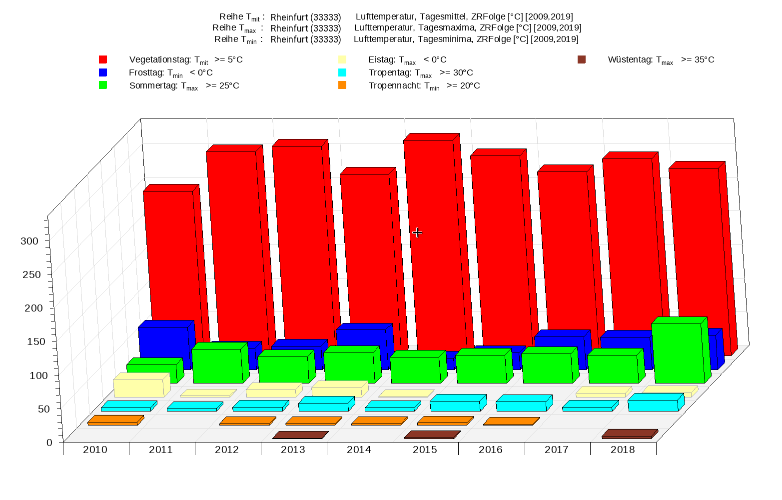
Included time series are automatically loaded onto as many interchangeable axis crosses, or axboxes, as necessary to give one Y-axis per unit. Up to two Y-axes are occupied per axis cross. While holding down the shift key, you can grab the time series with the mouse and move it to any other axbox. In placement mode (button with cross) you can change the position or size of the axbox with the mouse. If you remove an axbox (for example, by removing its last time series), the space is replaced by enlarging the remaining axboxes.
Converting and linking time series
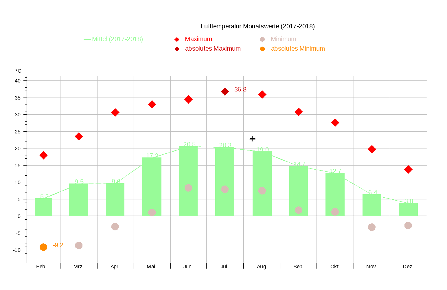
Do you want to compare, for example, the measured daily mean to the daily mean from the continuous measurement? With TopoVit, you can do it in no time. You double-click the continuous time series, TopoVit chooses from the many analysis options to analyze "interval means" with width "1d". Then, you can click on "OK" to display the daily means. When zooming or scrolling, the calculation is automatically redone. To link several time series to one, press the "Link" button. You can choose between ready formulas (e.g., Prio, Freight) or free formulas of the ZR Sequence System (e.g., Tube, MaxSum). In the example below, an air temperature time series with line width 1mm is shown in the lower axbox. In the upper axis crossing, the means analysis of the sliding daily maximum and daily minimum are displayed. Between them, a line was created by linking. Into the line the moving daily means were put as a dashed line. This graphic was created from a template.
TopoVit templates
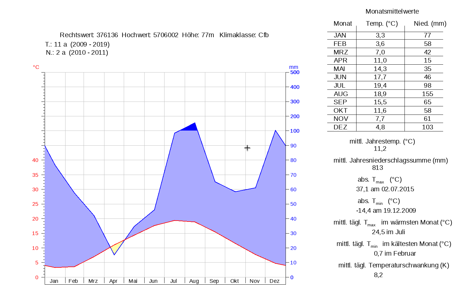
Templates are master layouts in which the stations are not fixed, but are prepared by the user. Example: You create a layout of a certain station with two axboxes, above water level in blue and below ground in red. Then, save this layout as a template. You will now start TopoVit in template mode and select a previously saved template. Then enter the station and press play. Now the water level for this station is shown in blue at the top and the drain at the bottom in red. Then press Plot and PDF to get a PDF of this station. Now enter a different location and press Play Plot PDF. This is how to do routine work in a hurry.
 +49 241 92 78 92-0
  post@toposoft.de